Before hiring a book cover designer for your indie published book, you’ll need to consider several important factors. The designer will want to know what you have in mind. Here are the items you should determine before contacting a cover artist.
Tone of Story. Is it serious, scary, or lighthearted and funny? What mood do you want to convey with your cover? What tone should your designer take for your work?
Type of Image. Do you want a realistic photo or a cartoony image? Or maybe just a pattern or flower or geometric design?
Colors. When you look at images, what colors jump out at you? Are there any colors in particular that would enhance your brand? For example, I like bold, tropical colors since my stories take place in Florida, but maybe you prefer pastels.
Genre Conventions. If your book is a romance, you might want a clinch cover or flowers or a photo that conveys the era and mood. I go for paranormal elements in my romance covers to indicate this particular subgenre. Cozy mystery covers have a certain humorous slant which I’ll ask my designer to emulate. Examine the covers for your genre and see which ones tell you at a glance what type of story to expect.
Suggested Scene. If you are going to have more than a pattern or single image on your cover, think up a scene that might work. For Shear Murder, my heroine discovers a dead body under the cake table at a wedding. I thought it would be fun for readers to see the feet sticking out from under the table on the cover. The victim is wearing plum heels.
For Warrior Rogue, I wanted both the hero and heroine on the cover, but the emphasis should be on the guy since the Drift Lords are the main feature. But I also wanted to convey the paranormal element, hence the winged creature and planetary body in the background. Jen is a fashion designer so I wanted her to have a sleek look. Even the lettering helps brand the series, which includes Norse mythology.
Text Font. This feature can enhance the mood. The text font can convey a humorous, gothic, historical, or eerie atmosphere. Or as above, it can enhance a feature of the story.
Text Color. White or Black? Or a color? Blend of colors?
Name Placement. Do you want your author name at the top, along the bottom, or mid-range across the image? Do you want your name to be bigger than the title or vice versa?
Cover Sizes. If you are self-publishing, you’ll need a thumbprint image, a size for websites, a high resolution image for publicity, plus sizes to fit audio and print editions. For print, you will also need the spine and back cover. Consider your back cover copy and quotes before contacting the artist.
Release Form. You’ll want a release from the designer that says you own the image and can use it in any manner necessary for book promotion.
The more precise you can be about what you want, the less corrections down the road.
40 thoughts on “Book Cover Design”
Comments are closed.





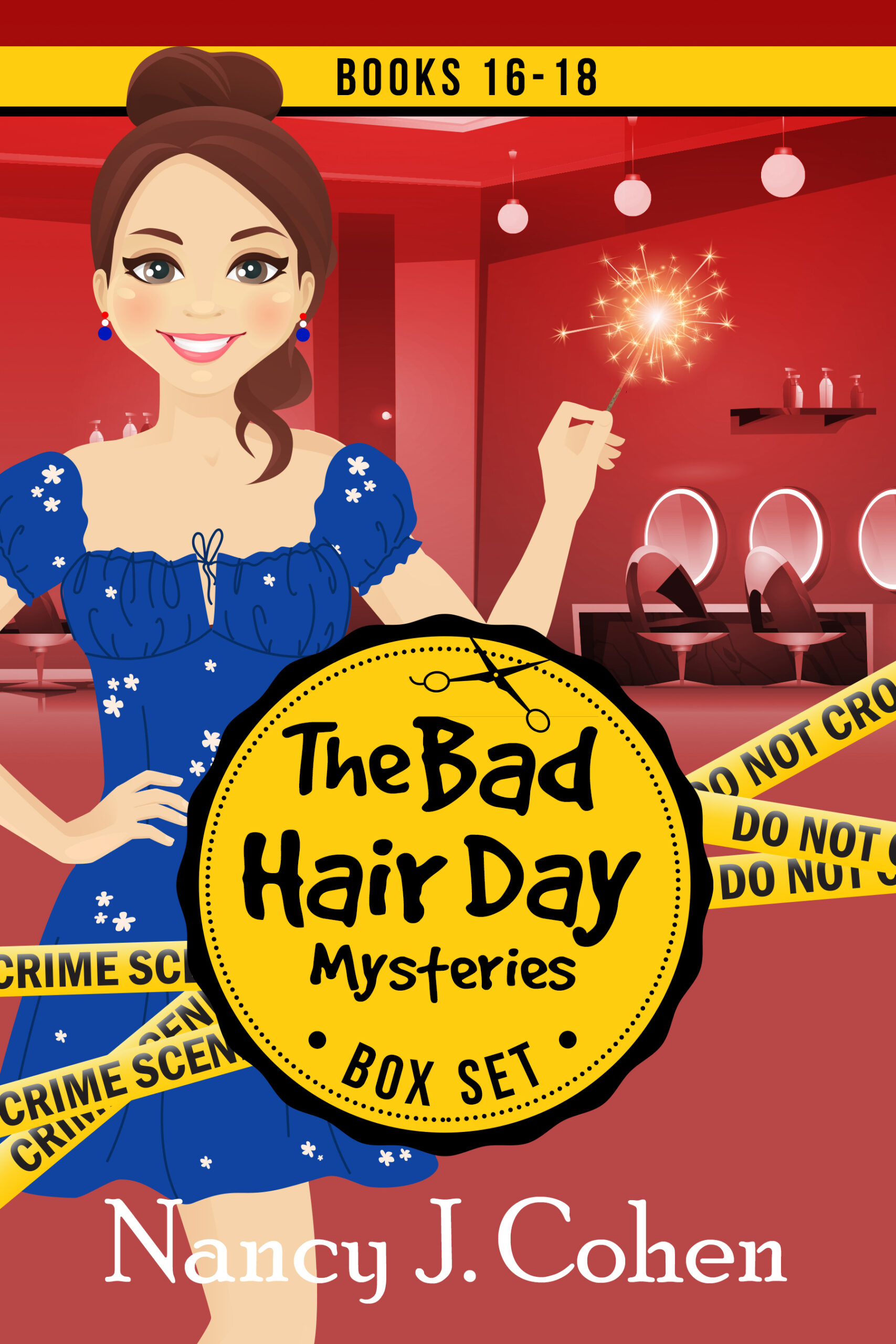


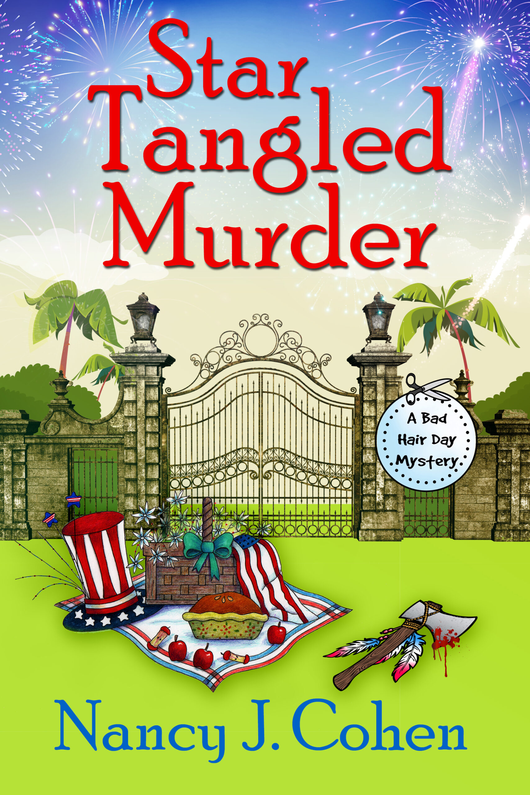

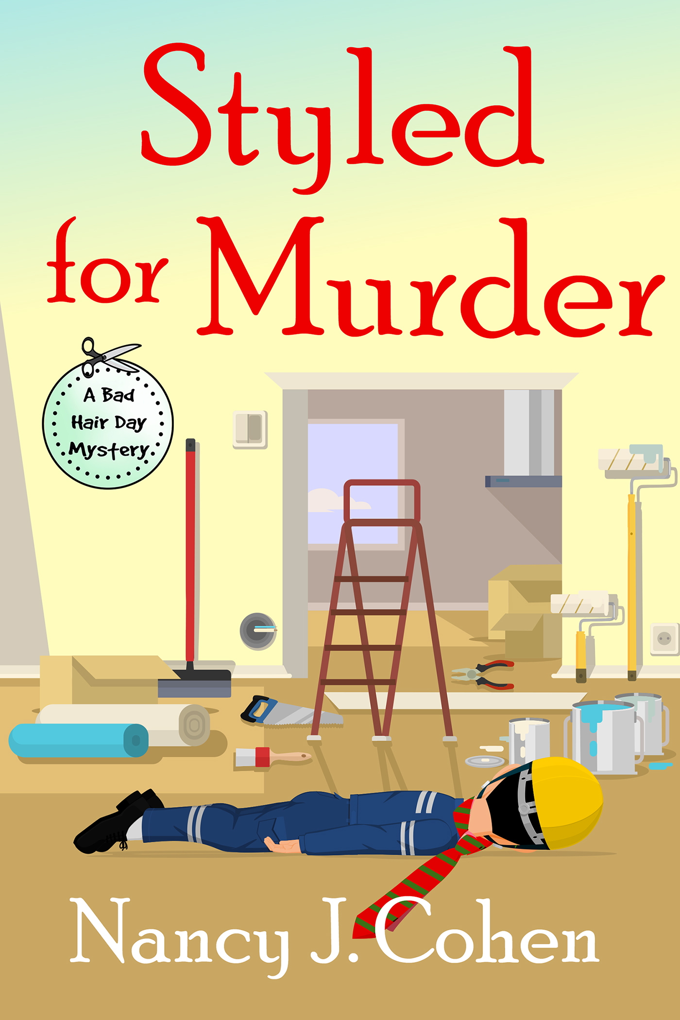
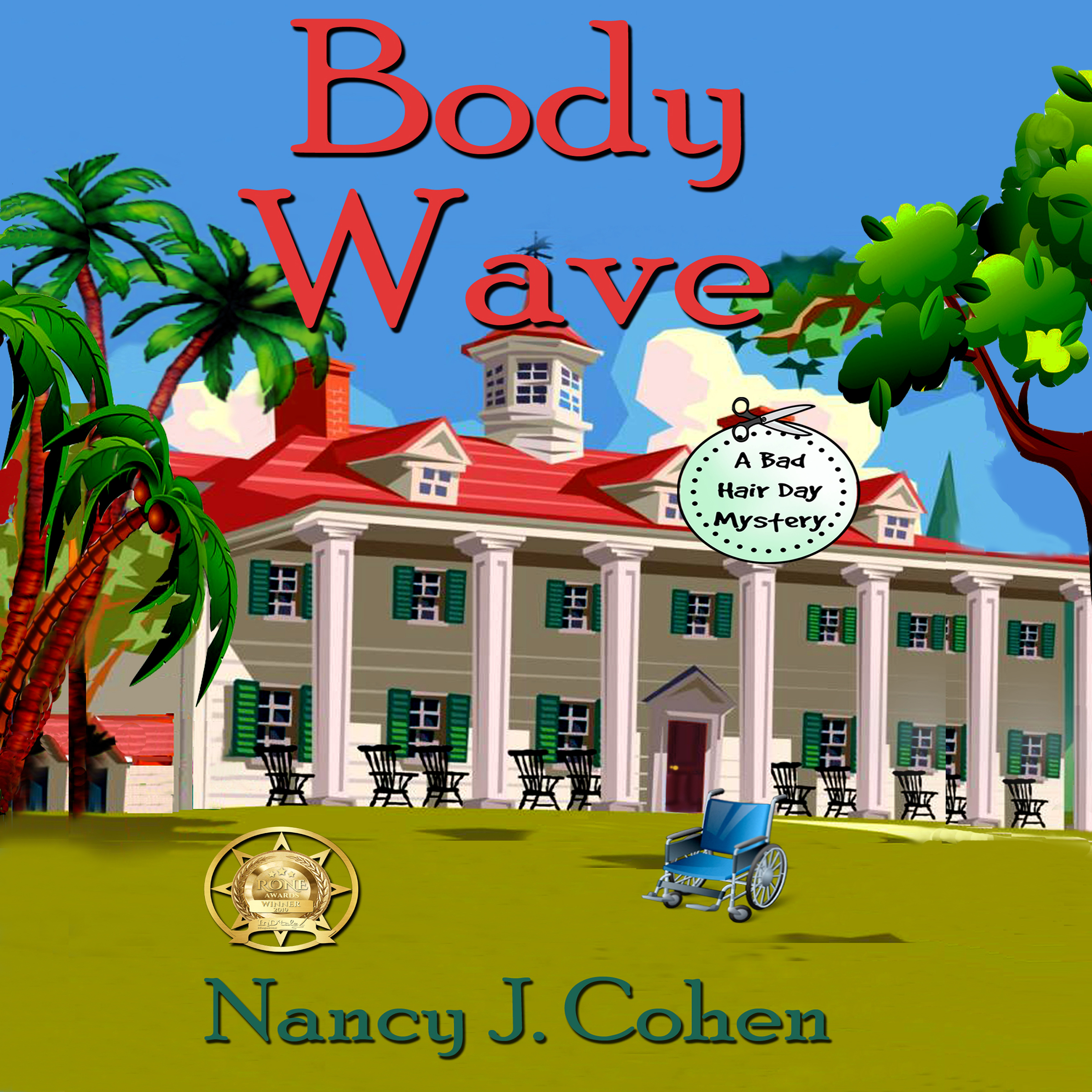


For my cover on From One Place to Another I brought in books of my genre (contemporary fiction) to my editor, who was also the graphic designer, and tried to fit those parameters. Couldn’t really find what I wanted, but I fell in love with the cover she found after we went through others. She suggested we add “a novel” so that people wouldn’t think it was a cookbook. Her advice was that the cover could readily be seen in a book store – and that it was the beginning of a “brand.” For my next book, I’ve kept the coloring, but having seen the designs yet. One of the reasons a local bookstore stocks my self-pub books is because she liked the cover. I think “Died Blonde” is very catchy.
I love your cover, Carol. It’s cute and perks interest, especially with the raspberries, but next time I wouldn’t do white on white. The chef’s uniform blends into the background.
My books are romantic suspense, and I always preferred the ‘suspense’ part on the covers. I think it’s also important to tie series books together so readers understand the books go together. And, one thing to consider when designing e-book covers is 1) look at it in thumbnail first. That’s the first impression people get when they go to the on-line bookstores. Also, be aware of any ‘alterations’ the site might make. For example, B&N often turns up the lower right corner to make it look like you’re turning the page. If your name or the book title runs all the way across the cover, it might get covered up. You can see how my cover designer and I dealt with this by stacking my name in my books–check “Finding Sarah” at the top of this blog post.
Terry
Terry’s Place
That’s a great tip, Terry, and it would apply to the “Look Inside” that Amazon does, too. You do a great job of branding with your covers.
You put forth some excellent points. As a book cover designer, I cannot tell you how often I have run into these issues. I want to provide the best cover at and be cost effective. By having a clear vision, you will save both parties time and frustration. I cannot begin to mention how many times I hear I want it exactly like _______________ but only different. I often like to ask for covers they have liked in the past to get an idea of what strikes their fancy, but overall a blurb or copy of the synopsis is best. I can change hair, eye and skin colors only if I know what to change them to. Like most relationships, one based on communication is essential. Be honest and voice your likes and dislikes. Cover artist can only go on what you provide.
Absolutely, Margie. It also helps to provide the cover artist with links to book covers online that match the style you want. Often we have to fill out art sheets for our publishers, and this same type of info is required. The more details you supply, the less work for the designer.
Nancy,
Thanks for the very useful tips!
I’m fortunate to have a publisher who considers my ideas and suggestions for my book covers. He’s the expert when it comes to design and color but, since I’m the author, I have very definite opinions on what images I’d like to use and what tone I’m trying to convey. So, it’s a joint effort.
Yes, it’s definitely nice when a publisher asks for our input on cover design.
Some good points I will have to think about. I’m working on (still not 100% commited) a self-pub in print only (somebody else holds the e-book rights, but I can’t use their covers). Since I’m trying to do it on the cheap, I’m doing my own cover. At least that way there’s no feud between the author and the cover artist!!
If you’re using one of the royalty-free photo image sites, check the licensing agreement to see if book covers are allowed. If you have the talent to do a design yourself, so much the better.
Nancy,
Great subject. Love your covers.
Thank you. I’ve been lucky with my covers so far.
All good advice! Book covers are so important, the first thing that draws readers.
Yes, a good cover is critical for drawing attention. It’s what catches the reader’s eye and makes them pick up or peek inside your book. Back cover copy comes next for a print book.
I’ve done book and magazine covers and as a professional artist I can say that people are attracted to pink. Even men. Turquoise is another great color, but it’s hard to reproduce accurately. Women notice flowers, especially flowers that are recognizable. The covers above that leave clear space for the title and author are easy to read. For instance, License to Lie and Shear Murder. Think punchy colors, not too cluttered. I personally feel comments about the writer by other people should go on the back cover. Don’t forget the spine. If it’s shelved, that’s all that’s visible. Snappy color, bold lettering and maybe a teeny illustration, flower, knife, gun etc.
Carol, thank you for sharing your insights. It’s a learning process to see what works and what doesn’t. I never thought about the names before being in front of a clear space but that does help with clarity.
A good book cover can make me stop and pick the book up. One of the things I find hardest is to create a brand for myself since I write in different genres and for different publishers. You have lots of good advice here.
Ditto for me with different genres, but you can brand each one separately. My Drift Lords covers have a similar concept and lettering. I have less control with the mystery covers but I aim for a certain look in filling out the art sheets.
Interesting post. I think that book covers are most important. I would say that 90% of the time I’ll buy the book if I like the cover. That’s why it’s really important for an author to think about the branding effect of their covers.
Yes, a cute cover for a mystery will always make me take a closer look. A beautiful woman in a flowing gown is another one that might have me take a second glance. Each of us probably has a trigger as a reader that draws us in.
Nancy, you give lots of good ideas, as usual. I love covers that pull me in, no matter what genre.
Me, too. Covers are so important but they’re not always under our control.
Thank you for such a great and informative post (as always), Nancy. I am taking note! And thanks to everyone who responded with additional thoughts, as well. I am so lucky to have a graphic designer as a best friend, but it is really important that I am able to communicate what I want to her. Also, I will have a small chapbook coming out on Kindle in October, and I am thinking about doing my own cover as a way to try out the new Kindle Covers option. These tips will really be helpful to me.
Kindle Covers? What is that?
OH, it’s fairly new, Nancy. Kindle now offers a way to create your own covers online with them. They have a huge library of royalty free images and the software lets you drag and drop titles, subtitles, author name, etc, and play with fonts and colored backgrounds and all. It’s a great option if you have a good eye for selecting images and fonts, etc, and are good at composition. AND can’t afford to get a professional to do your cover.
I have seen some nice ones made from it and some that are disasters. PLUS, I forgot, you can upload your own images, too, as long as they are your photos or royalty-free ones or ones you have bought. I can see it being very useful in some situations. I certainly think for my little poetry book, it would be all I need, and I think I’ll probably use one of my own photos and then assemble everything else in the program. Then you just save it to use when you upload your book to Kindle. Voila!
Interesting, huh?
Great info, Marcia. This might be perfect for the writing booklet I hope to self-publish.
That’s the kind of thing it would be perfect to test it on, I think. Where you want a nice, professional cover, but don’t have as many requirements as you might for a novel you really want to jump out at people. You can do everything from a solid color with clever fonts, to using all sorts of images in various ways. And once you have your components picked out, you can arrange and rearrange them, resizing, etc, until it looks like you want it to look. I’m excited to be learning how to use it for certain books I want to do. Will let you know how it works for me when I try it on my chapbook in a couple of weeks.
This Kindle Covers thing might be worth looking into, I assume it would be usable for a CreateSpace book. I’m perfectly capable of doing covers with The GIMP (a free Photoshop clone), but sometimes it’s hard to find images that are legal to use … if they have an image library, that sounds good.
I don’t know if it would work for anywhere else or not, Nancy. My feeling is probably not. For one thing, it is for a front cover only, and for Createspace, you need front, back & spine, of course. Plus, I’m not sure whether it can be saved as a separate file. You sort of put it together with your KIndle package, I think. I could be wrong about that. I’ll be giving it a try in the next week or two, though, and I’ll be happy to let you know what my experience is like, and what kind of file I end up with.
Sorry. I meant to address this to James! Still asleep, I think.
Good point in that this cover would only be usable on the Kindle edition. For Createspace or an other ebook site, you’d still need a regular cover.
Nancy, if you ended up with a hi-res .jpg file you could save from the Kindle Covers thing, you could perhaps use it for the front of a print cover, and design a back & spine to go with it, but it might be tricky, and I don’t even know if Kindle would let you save the cover file outside of their program. Lots to learn here. I’m on a mission to master the technique and will report back what I discover. 🙂
From looking at CreateSpace, I think they are owned by Amazon. At least, their “standard distribution” includes both the CreateSpace site and Amazon. If I am right about this, it seems likely that “Kindle Covers” might be usable on CreateSpace books. Just a guess on my part, of course.
James, that is exactly right, but you still have to provide a spine and back cover design, and I don’t think you can do that in the KIndle Covers program. But possibly, as I mentioned, you can save your front cover and expand it. Having just done my first Createspace cover (with my friend who is a Graphics Designer), you must use a template provided by them, which comes with trim space and bleed space and stuff like that marked on it, and your book length determines which size book you should choose, and how wide the spine has to be. Lots of stuff that doesn’t apply to the Kindle covers. So you wouldn’t be able to submit just that cover, but you could possibly work with it to add what’s needed to make it doable for Createspace.
Well, I’m working on something to go in CreateSpace, but I haven’t got to that level of detail yet. I have a (draft) front cover, and if they want me to fit it to their template, I guess I can do that. Back cover, probably just the background from the front plus a bunch of text. Spine … I’ll have to figure that when I get to it, once I get the number of pages nailed down (still doing a little formatting). Man, I’m learning a lot doing this!
I have my novel done and converted into CS format, which took some doing, because their 5.25 x 8″ template was a bear to figure out, but I got it. And I downloaded the appropriate cover template and my friend the designer had my cover laid out in it in 15 minutes. How lucky am I? She’s amazing. But I agree with you, the entire process is a major learning experience. I took good notes, though, and I’ll be ready the next time. (I have heard if you get one page number off, they will kick the whole thing back to you, so it’s apparently important to get it right the first time. I know the trick now! 🙂 ) And the learning of it all is good for us. Keeps ME young, anyway. 😉
I absolutely love your covers, Nancy. Obviously a lot of thought and care have gone into their designing. Great information as always!
Thanks so much, Lynn.
Would you be able to recommend a book cover designer? ReporterandTheGirl@gmail.com if you can send a name.