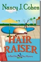
Book Cover Design Process

When designing a book cover, a number of items need to be considered. What is the genre? The mood of the story? The background setting? What type of “look” do you want to get across? Is this best done with photography or illustration? Do you like people on the cover? Can you describe a particular scene you envision, or images that might work?

When I contacted Patty G. Henderson from http://boulevardphotografica.yolasite.com about doing my cover for a revised edition of Hair Raiser (Bad Hair Day Mystery #2), I gave her a basic summary of the plot. Hairstylist Marla Shore volunteers for Taste of the World, a fund-raiser to benefit a coastal preservation society. Someone is sabotaging the chefs involved in this gala event set in South Florida. I wanted to blend elements of the tropical setting with the food theme and also give a hint about the murder mystery.

I mentioned Bonnet House to Patty. This Fort Lauderdale historic attraction served as the model for cousin Cynthia’s estate in the story. Photos on their website could provide inspiration. After a while, Patty sent me these two mock-up covers for my initial inspection. What did I like or dislike about them? What should we change?

clip_image002 clip_image004

I was awestruck at how Patty instinctively understood my brand as an author and the genre in which I write. Since I write humorous cozies, I’ve noticed these covers are mostly illustrations rather than photographic portrayals. Readers like me want to be able to tell the genre at a glance. I had sent her a list of covers on Amazon that appealed to me as a reader. This mockup got the concept just right.

Patty covered the murder mystery aspect perfectly with the bloody scissors. She got the chef part of the plot correct with the serving dish. And she got the seaside location fine. However, Florida doesn’t have mountains. So that hill behind the building had to go. I’m also not fond of pastels. I like sharp, bright colors representative of the tropics. But I did like the green, coral, beige, and turquoise tones. However, they needed to be sharpened and made darker.

On proof number one, the cover on the above left, the title font is cute and appropriate to a humorous mystery. But it’s too light. So is my name. And from far away, you can’t see the series title at all.

On proof number two, I don’t care for the series logo either. We need a different symbol than the shears because Five Star uses them on my new titles. And this wave design would have to be carried through on subsequent books in the series. I liked the one on the left but that wording doesn’t show up. So let’s get rid of the wave altogether and work on a series title that’s more visible.

clip_image006 clip_image008

These are better with brighter colors and sharper wording. Looking at proof number 3 on the left, I note the mountain is gone. I like my name at the top in dark green. The top of Hair Raiser, though, is hard to see because of the busy background elements. And I’m not crazy about the three combs. They’re cute but show no element of mystery.

Number 4 on the right is better. But oops, the mountain is back. I like the title font, color and placement. I like my name where it is but more to the right, so it’s all in the turquoise section. And I like the crossed teasing combs for the series logo but not dividing up the wording. What if we move the series logo above my name? That might work.

clip_image010

“Is this the winner?” Patty asked. “Oh, yes,” I replied. ”It’s perfect.” Finally, we had our cover! I do love it, the images, the fonts, the colors—everything.

But were we done? Not yet! Next came the paperback edition. What did I want on the back side? A solid color or some of the front image? Did I want the book title at the top of the back or the series title? What do we want on the spine? And so here is the final result of this process:

clip_image012


It requires a lot of patience between both parties to get things done just right. But the results are definitely worth the thrill you get when everything falls into place.

To contact Patty G. Henderson, go to http://boulevardphotografica.yolasite.com/

Join my book launch party on Tuesday, Jan. 27, from 6:00 – 8:00pm EST at https://www.facebook.com/NewReleaseParty for Fun and Giveaways!

HAIR RAISER Buy Links:

Kindle: http://amzn.to/14M9l5B
iBooks: https://itunes.apple.com/book/hair-raiser/id957020158?mt=11&uo=4&at=113vsrx
Kobo: http://store.kobobooks.com/en-US/ebook/hair-raiser-2
Nook: http://www.barnesandnoble.com/w/hair-raiser-nancy-cohen/1017599109?ean=2940149980222
International: http://bookgoodies.com/a/B00S4VCUM8
Print Edition: https://www.createspace.com/5253406

Add to Goodreads List: https://www.goodreads.com/book/show/24478683-hair-raiser


Book Cover Design

Before hiring a book cover designer for your indie published book, you’ll need to consider several important factors. The designer will want to know what you have in mind. Here are the items you should determine before contacting a cover artist.

Tone of Story. Is it serious, scary, or lighthearted and funny? What mood do you want to convey with your cover? What tone should your designer take for your work?

Type of Image. Do you want a realistic photo or a cartoony image? Or maybe just a pattern or flower or geometric design?

Colors. When you look at images, what colors jump out at you? Are there any colors in particular that would enhance your brand? For example, I like bold, tropical colors since my stories take place in Florida, but maybe you prefer pastels.

Genre Conventions. If your book is a romance, you might want a clinch cover or flowers or a photo that conveys the era and mood. I go for paranormal elements in my romance covers to indicate this particular subgenre. Cozy mystery covers have a certain humorous slant which I’ll ask my designer to emulate. Examine the covers for your genre and see which ones tell you at a glance what type of story to expect.

Suggested Scene. If you are going to have more than a pattern or single image on your cover, think up a scene that might work. For Shear Murder, my heroine discovers a dead body under the cake table at a wedding. I thought it would be fun for readers to see the feet sticking out from under the table on the cover. The victim is wearing plum heels.

For Warrior Rogue, I wanted both the hero and heroine on the cover, but the emphasis should be on the guy since the Drift Lords are the main feature. But I also wanted to convey the paranormal element, hence the winged creature and planetary body in the background. Jen is a fashion designer so I wanted her to have a sleek look. Even the lettering helps brand the series, which includes Norse mythology.

Text Font. This feature can enhance the mood. The text font can convey a humorous, gothic, historical, or eerie atmosphere. Or as above, it can enhance a feature of the story.

Text Color. White or Black? Or a color? Blend of colors?

Name Placement. Do you want your author name at the top, along the bottom, or mid-range across the image? Do you want your name to be bigger than the title or vice versa?

Cover Sizes. If you are self-publishing, you’ll need a thumbprint image, a size for websites, a high resolution image for publicity, plus sizes to fit audio and print editions. For print, you will also need the spine and back cover. Consider your back cover copy and quotes before contacting the artist.


Release Form. You’ll want a release from the designer that says you own the image and can use it in any manner necessary for book promotion.

The more precise you can be about what you want, the less corrections down the road.